Web · · 5 min read
From a slow website to a fast mobile-first site
The method behind a prototype we built for Macro Meals: rebuilding a slow meal-prep site as a lean, mobile-first static site. Still in development.
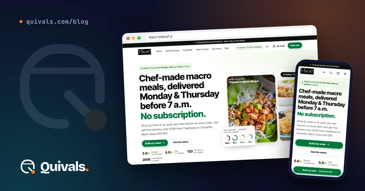
A slow website rarely has one cause. It’s usually years of small additions: a video here, a plugin there, a theme that loads code for features nobody uses. Each one seemed harmless. Together they make customers on a phone wait, and many of them leave.
This post explains the method behind a prototype we built for Macro Meals, a meal-prep delivery business in Westlake Village, California. The goal was to rebuild a slow site as a lean, mobile-first static site using the business’s real menu and nutrition data. The project is still in development. It’s a proposal the business hasn’t approved yet, and the prototype isn’t public. Every number below comes from lab tests of the prototype on October 1, 2026, not from a site in production.
The problem: a menu that took too long to appear
For a meal-prep business, the website is the menu. Customers want to see what’s available this week, check calories and protein, and confirm that delivery reaches their ZIP code. Most of them do it on a phone.
When we tested the current site’s homepage on mobile, Lighthouse gave it a Performance score of 32, and the main content took 18.1 seconds to appear. The homepage weighed 3.7 MB. On a typical phone connection, that’s a long wait before a customer sees a single meal.
Our method, step by step
We didn’t start with a redesign. We started with the content and the speed budget, and let the design follow.
1. Start from the real data. We built the prototype from the business’s own menu and nutrition information, not placeholder text. The prototype has 118 meal pages with real nutrition data. Working with real content early shows the actual problems: long names, missing values, photos of different sizes.
2. Decide what each page must do. A meal-prep site has a few jobs: show the menu, help people plan their week, confirm delivery and answer common questions. We built for those jobs: a menu explorer, a “Build My Week” planner, a ZIP code checker, 8 city pages for the delivery area and a questions assistant in English and Spanish. The assistant uses fixed answers, not AI, because the questions are predictable and the answers need to be exact.
3. Make pages static by default. The prototype is built with Astro as static pages and served from Cloudflare. A static page is ready before anyone asks for it, so the server has almost nothing to do. Most of the menu doesn’t change minute to minute, so there’s no reason to rebuild it on every visit.
4. Add JavaScript only where people interact. Interactive parts, like the weekly planner and the menu filters, load small pieces of code called islands, built with Preact. The rest of the page is plain HTML and CSS. This is the biggest single reason the pages stay light.
5. Design for the phone first. We designed every screen at phone width first, then expanded it for larger screens. Starting small forces hard choices about what matters, and those choices make the desktop version cleaner too.
6. Measure, then fix, then measure again. We ran Lighthouse on mobile, with standard simulated throttling, on every key page, compared the results with the current site and fixed what fell short before calling anything done.
What the lab tests showed
Measured on the prototype’s preview address on October 1, 2026, on the homepage, mobile:
- Lighthouse Performance: 97 (current site: 32).
- Main content visible (LCP): 1.6 seconds (current site: 18.1 seconds).
- Homepage weight: 529 KB (current site: 3.7 MB).
- Accessibility and Best Practices: 100 each.
- Layout shift (CLS): 0, so nothing jumps around while the page loads.
These are lab results for a prototype. Real-world numbers depend on real visitors, their phones and their connections, and we’ll only know those once a site is in production. Still, the gap between the two versions shows how much of a slow site’s weight is optional.
Trade-offs we’re working through
- Static pages need a build step. When the menu changes, the site has to be rebuilt. For a weekly menu that’s a small cost, and it can be automated.
- Fewer plugins means fewer instant features. Some things a plugin gives you in one click have to be built on purpose. In return, nothing loads that the page doesn’t use.
- Real data takes more work up front. Cleaning a menu of more than a hundred items is slower than dropping in sample text. It’s also the only way to find the problems before customers do.
What this means for your business
If your site feels slow on a phone, these steps apply to almost any small business:
- Measure before you redesign. Run a mobile test on your homepage and your most important page. Write down the score, the load time and the page weight. That’s your starting point.
- List the jobs your site must do. Everything else is optional. Most slow sites carry features nobody asked for.
- Look for the heavy items first. Large videos, oversized images and unused code are the usual causes. Removing one heavy item can make a big difference.
- Prefer static pages for content that rarely changes. Menus, services, prices and location pages don’t need to be built fresh on every visit.
- Use JavaScript only where people click and type. A page that’s mostly reading doesn’t need a large app behind it.
- Test on a phone, not just a desktop. Your customers are on mobile. Your tests should be too.
- Report results honestly. Say whether a number comes from a lab test or from real visitors, and on what date.
Where to start
Pick your homepage and run a mobile test today. If the main content takes more than a few seconds to appear, there’s room to improve, and it’s usually cheaper than a full redesign.
You can see this project’s status in our work, and read how we approach this kind of rebuild on our web modernization page.
Want to know why your site is slow? WhatsApp or text us at (805) 750-3255, or use the contact form.